
Tuesday, 13 July 2010
Monday, 3 May 2010
aauugghhh. This is what happens when you don't post....

To know me is to know I've been talking about the character Jeff Spicoli for the past year. Something about those vans of his and the scale of that check. And the short sleeve over long sleeve. And the shorter shorts. And I thought I was the only one who was all Fast Times on my mood boards. But then I read this... And I have learnt my lesson... Post while the iron is hot.
Thursday, 29 April 2010
2 Yards, 2x?
I read this article in today's NYT style section inbetween my first and second cup of tea this morning. I noticed 2 interesting things about band of outsider's trouser making. 1. their fabric consumption is 2 yards! 2. Their wholesale mark up is 200%. Interesting.
Monday, 22 March 2010
Cuts


Saturday, 13 March 2010

Tuesday, 2 March 2010
1000 and 1 Pockets: Pocket 1

I don't read many fashion magazines. They are pretty expensive, and heavy. When I'm in a waiting room with some good ones, I devour them. Here begins a new Pink Is the Navy Blue feature: 1000 and 1 Pockets. Jil Sander pocket from Brogue. March issue, I believe.
Cafe Oto

Wednesday, 24 February 2010

Friday, 19 February 2010
Something.

I've started a bunch of posts but haven't been able to finish them lately. I took this picture on the walk to work this morning.
Sunday, 24 January 2010
I forgot it was mensweek.
Last weekend was the first weekend of my new year. I forgot it was men's week the world round- or at least on the northern hemisphere. I'm pretty slow at getting to the pictures.The quilted Lochcarron (?) striped jackets at Dries made me smile; the masks at Adam Kimmel distract my attention from the clothing. Instead of focusing on the collections, I'm trying to catch up on my sleep. I recently rediscovered a favourite style blog: This Is Naive.
Tuesday, 19 January 2010
Teenage Iconography?
As a designer, I am much more fascinated by how proper adults live and dress than by youth culture. Maybe this started years ago when I interned at the Costume Institute at the Metropolitan Museum of Art and did some research for their exhibit Blithe Spirit: The Windsor Set. My research mainly consisted of reading 3 decades of American, French and British Vogue*. Two things stood out in this reading:
- Vogue should have a comprehensive index that catalogs everything including advertisements, photographers, subjects, and everything conceivable.
- The great beauties and fascinating figures were proper adults. They were not teenagers or young women, but actual grown ups.
I don't think I'm the only one. Please watch the above video and note Jason Lee's cap. And then check out Mister Mort and J.Crew's caps. The teen style you grew up around is probably the first style you consciously reacted to and had the means to choose on your own. All else is to some degree or another memories and reactions to that. In the sea of east london slim trousers and fixies, those huge jeans are so exciting. And now designers my age are reaching positions with decision making power where these collective memories can be put to use. For my own research I keep downloading varsity letters from A Reference Library's sharp eyes:

I'm not sure where these varsity letters will lead me. They aren't really appropriate inspiration for my current work.
* Lee Miller referred to these publications as Vogue, Frogue, and Brogue. Isn't that the funniest thing you've ever heard?
Whoa!

This exhibit called Ramp It Up: Skateboard Culture in Native America at The National Museum of the American Indian in NYC looks like the most fascinating ever. If you go, can you let me know how it is and maybe buy me the catalogue. We are seriously thinking about booking flights to NYC in part to see friends and family, but also to go to this exhibit.
Monday, 11 January 2010
SS1011: Design by Harmonized Tariffs?

Les Douaniers
One reason, I think I'm a menswear designer rather than a womenswear designer is because the tighter the parameters, the more creative I am forced to be. In menswear there is very little wiggle room and an interesting, attractive, feasible design must fit the rather stringent criteria. Sometimes, especially here in London, I end up thinking of 'creative' womenswear as ghastly concoction of polka dotted ruffles onto more ruffles in a silhouette that can only be described as 'challenging'. I work for a small company, so I don't get to hand off a tech pack to another department and then, as if by magic, 6 months later my designs are in the stores. Instead I'm involved in all steps of the process, so I move designs along from initial idea all the way to a piece of clothing that you pick up, buy and take home. Today, I spent several hours working on calculating the entry duties for designs that will be exported into the USA. So, for instance, men's water resistant cotton anoraks are charged at different duty rate than, say, quilted silk overalls with 45% down/55% quilting. I'm sure there was a West Wing episode about protectionism, but I was probably concentrating on the Toby's love life subplot. This stuff is complicated and I don't really understand at all why it works the way it does. But these are the rules and they can explain why your coat costs 25% more (or less) elsewhere in the world without counting for recent currency wobbles.

Henry Morton Stanley
Should you have a lot of spare time, and love incomprehensible government resources. Check out this one. I like Section XI, Chapters 61 and 62.
Wednesday, 6 January 2010
Inspiration: Raymond Chandler and Godard on Colour
I spend most of my free time reading for pleasure. So, it isn't shocking to me that reading is usually at the root of my inspiration--be it the J.Peterman catalogues*, descriptions of Bruce Patman, coal miners wearing suits in Zola's Germinal. Alas, the printed page doesn't make for the most visually beguiling research in a portfolio. More often, I am intrigued by how authors' descriptions of colours are what get my designing mind racing. I'll take Steinbeck's first chapter of East of Eden over the complete collection of (both!) Steve McQueen(s!) images any day. Nabakov's Ada or Ardor is another key text in how I react to colour combinations. If somebody else were to read these and design a collection, the colours that they would identify as parched California earth or black fur against cream would be different than mine. And maybe they wouldn't even identify these colours as the inspirational material in these writings**. Let me get to my point: I'm 2 1/4 through a collection of three of Raymond Chandler's stories. His style is so spare that at first I didn't notice many mentions of colour and clothing. I was shocked when I noticed Marlowe commented on a starlet's white blouse with a scarlet scarf around her neck contrasting with her dark braided hair and her pale centre part. But now that I'm starting to read a bit more critically, colour and costume are all over the place:
It is funny, because the words of those colours and fabrics: sky-blue gabardine, zebra, canary-yellow, pale salmon remind me of my memories of the film we watched 2 nights ago, Pierrot Le Fou, where those slightly bleached, but otherwise heavily saturated colours sorta burn into my retinas and frontal cortex.

But the Pierrot Le Fou colours have more sizzle or something. I imagine the Chandler colours filtered through a dusty, smoggy, sepia lens, where Godard's are only muted only because you are looking at them through an icy glass of pastis. I don't know if that makes sense to you. I guess that is why I've started this blog, to help me express what I'm thinking in terms of design. This year is both new and snowy, and my brain is starting to think about SS2011.
*If you are reading this blog, you probably know me in real life and are thinking "why is Elizabeth writing in British English; she is American? I know she can be all affected and only eat raw milk cheeses, but this is a bit OTT." My answer is this: America doesn't need another style blog; England does. Although I get much of my news from American websites, most of what I look at is on this funny island.
** At work, I realize how subjective the experience of colour is. I call a tweed "wheat;" the guy sitting next to me calls it "green."
Tuesday, 5 January 2010
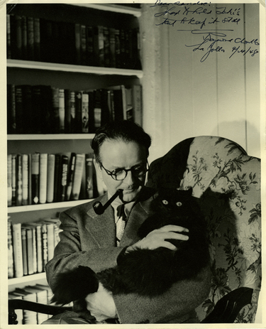
Harvey Peekar, Richard Belzer; Compare, Contrast

I'm not being facetious or ironic; I adore both Harvey Peekar and Richard Belzer's style. I don't think either of them get enough credit for their awesomeness.
Pink is the Navy Blue of India
Welcome to my new blog about being a menswear designer. Here, I hope to show pictures and link to ideas that I find inspirational, and maybe, discuss them with you. Notes on Harvey Pekar to follow soon!
Subscribe to:
Posts (Atom)

